|
David Jones Painting in Love: The Lee Shore and Trystan ac Essyllt
Two of Jones’s late paintings originate in powerful erotic longing, The Lee Shore (informally called Gwener, Welsh for Venus) and Trystan ac Essyllt. He painted the first in 1959 and began the second immediately after. Both are informed by the artist’s aching, hopeless sexual infatuation for Valerie Wynne-Williams. She was thirty-three years younger and had recently left London to begin married life in Wales. The first of these pictures is, I think, an aesthetic failure; the second a masterpiece. The failure is owing to subjectivity determining the artistic process (a series of judgments); the success is owing to objectivity governing the artistic process.
On the afternoon of 21 June 1929, he was visiting the Gills at Pigotts when a mutual friend named Oliver Lodge arrived from London with a stunning brunette named Enid Furminger, wearing a long fur coat and nothing else. She posed nude for Lodge, Gill and Jones. The result for Jones is the most erotic picture he would ever make (fig. 1). Douglas Cleverdon wanted it, and Jones sold it to him on the condition that it not be exhibited. In 1972 Cleverdon wanted to include it in the David Jones Word and Image exhibition he was organizing, and Jones said no. [1]
He told a friend that he wished he had burned it. [2]
After painting it, he habitually distorted the nude figure. This can be seen in his preliminary drawing of a scene from Malory in the early 1940s (fig. 2) in which the tiny breasts and vast pelvis of Lady Lyons make her an aesthetic rather than an erotic object.
In The Lee Shore (fig. 3), Aphrodite reclines like the Rokeby Venus, though—and this, for me, is the most interesting thing in the picture, an effective indication of her divinity—her upper torso floats above the bed on thin air. Her face in her mirror is that of Valerie Wynne-Williams. In this picture, Jones wanted to combine allusive precision with directness and freedom. He afterwards thought he failed to achieve freedom. That is, I think, debatable. The problems (there are two) seem to me 1) that it is aesthetically insufficiently interesting and 2) that the central image of Aphrodite’s bare bottom is distracting, at least for the large portion of prospective viewers who are heterosexual men. The painter Ray Howard Jones posed for that bottom while visiting David Jones one afternoon with her photographer lover, Raymond Moore. You can see in Jones’s sketch of her (fig. 4) that there is little or no resemblance to the nude reclining in the painting.
The subject of his next painting is Trystan and Essyllt (the Welsh versions of Tristan and Iseult) immediately after drinking the fateful love potion as Trystan is bringing her from Ireland to her wedding with King Mark of Cornwall. Jones’s source was Malory, not Wagner, whose music Jones disliked. (At concerts, he said, Wagner made him “flee to the bar.”) [4]
This picture was his main artistic concern for the next two years.
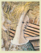
He decided to put the lovers above deck and needed to know what an early medieval ship looked like—”not for ‘accuracy’ for its own sake, still less ‘realism’“ but because, “to juggle with the form and content of chaps messing about with cordage, canvas, tackle etc, I needed to know how, in fact, these things worked.” He consulted eight books, his large collection of clippings of photos of ships, copies of two nautical magazines to which he had long subscribed, and his friend the sailor Michael Richey, who told him that an early medieval vessel would have been an open boat, but that would resemble a Viking ship, which Jones did not want. He took the basic shape and disposition of his ship from his 1931 frontispiece of Claudel’s The Satin Slipper (fig.5), which shows the whole deck from inboard looking aft. As in the frontispiece, the principal unifying elements would be threefold: tone, the sweep of the hull, and the rush of the deck.
He decided to place the ribs unrealistically on the outside of the hull as well as on the inside visible through the open hatch. “That was pure license on my part, a bit of ‘surrealism’ if you like.” He loved the look of the ribs and he wanted them seen, but there was also a compositional advantage. He writes, they “continue the sweeping line of Essyllt’s figure & gown.” [5]
He wanted temporal setting to be February first, the feast of St Bridget, patroness of Essyllt’s native Ireland. He copied the star chart in The Times of 2 February (fig. 6). “I didn’t want to put in stars just where I thought they’d look nice. That may sound rather absurd, but I must have something concrete to go by.”
Jonathan Miles and Derek Shiel assert that this “reveals a pedanticism that allows the essence of his picture, as well as its formal considerations, to escape” (225). Their judgment is uncertain: they do not know or specify “the essence of his picture,” but, they might say, that is because it has escaped. (I will argue that it hasn’t and I will disclose it.) Their judgment also represents the triumph of thinking over seeing. In copying the star chart, Jones did not sacrifice beauty for truth: the stars in their constellations light
Jones writes, “I wanted it to be neither night nor day but all about one tonality.” He achieves that by making the stars visible in what is otherwise a daylight sky—as he had done in the Satin-Slipper frontispiece.
Sarah Balme, an artist and wife of a Harrow master, watched him at work early on, and remembers:
The paper on which he worked was shiny, the shine making it easier to erase, but under continued erasure the paper deteriorated. [7] A young artist-friend named Peter Campbell commented on the poor quality of the paper. Jones said that what he needed was four-hundred-pound hot-press Spotten paper, not available in Harrow. Campbell went into London to an art supplies store and asked for it. The clerk brought the manager, who said, “Whom is this paper for?” Campbell said, “For David Jones.” “Oh, yes,” said the manager, “you can have four sheets. Campbell bought three, at about Ł12 per sheet. (That was in 1960—it would be Ł60 per sheet today.) To one of these, in early March 1960, Jones transferred the picture. [8] So there are two versions, the old (fig. 7) and the new (fig. 8).
He was often tempted to abandon the new picture. It may have helped that, visiting him on separate occasions, Kenneth Clark and the painter Ceri Richards said they liked it. For long periods he kept it on display simply to look at, doing nothing to it, unable to “see, with clarity, what it needs.” One of the problems was to keep it from looking historically “too late” He told the painter Arthur Giardelli (who also liked it very much, and said so on his numerous visits), “It kept on looking like the death of Nelson.”
[9]
By August 1960, Jones thought he might have to abandon it because, he wrote, “I like it (and I don’t usually like things I do much), and don’t want to wreck it.” [10]
Refusing to give up, however, he kept looking and, occasionally, making slight changes.
In February 1961, he felt it was nearly finished but was trying to decide what to do with “the passage” between the heads of the two main figures. He writes, “Now I’m afraid of touching it in case I make it worse; because the balance of the colours and tones is so very close that one false step & I’ve had it! At least, I mean, all sorts of other passages would have to be modified”—not easy to do in watercolours. (“One false step & I’ve had it” —remember that expression.) He knew from experience about “finishing touches,” how often near the end, “when one has managed to get some sort of wholeness into the thing” a change can ruin it completely.
In early 1962, he worked on the area behind the cat, which gave him trouble for months. [13]
In as 1969, he showed the picture to a recently married friend, Jane Carter, and her husband, who was a sailor and pointed out a mistake in the ropes at the bow. Extremely grateful, Jones fixed it. He never considered the picture finished, and wished on that account that it not to be exhibited. [14] He would
In the picture, historical indeterminacy emerges from a combination of modern stylistic distortion and medieval content and composition. This combination is effective and enriching. The style is medieval in its abundance of highly defined, incidental detail. The design expresses medieval conventions of importance: the lovers are central and disproportionately large. But the picture is also modern in shifting or bending perspective, in varying sharpness of focus, and in the cartoonish outline of figures, especially elongated Essyllt. [15]
Miles and Shiel are mistaken, it seems to me, in thinking that “a sense of the contemporary escapes” the picture and regretting “the desiccating effect” of Jones’s “antiquarianism” (229, 224). [16]
The combination of medieval and modern elements of design establish a historical indeterminacy, which extends the indeterminacy between day and night mentioned earlier and implies that the event transcends specific temporal setting. Passion has no period. The modern artist (in love with Valerie Wynne-Williams) feels what Trystan feels in medieval legend. Moreover, the artist was now 65 years old! He may have remembered that 35 years earlier his favourite film—he had seen it several times—was The Blue Angel, in which an elderly teacher falls disastrously in love with a young cabaret singer played by Marlene Deitrich. [17]
The size of the couple only just balances the chaotic movement behind and above them, a visual chaos that suggests their being caught up and lost in passion, particularly Trystan, who seems to fade into the background. The busyness balances the centrality and size of
Space shares some of time’s indeterminacy. Essyllt’s vertical axis seems nearly perpendicular to the ship while Tristan’s axis is determined solely by gravity. So that the ship and the earth are distinct from one another as spatial dimensions. The angle between her foreleg and his sword measures the difference. Their differing visual spaces suggest differing subjective realities. His passion validates the contextual metaphor by which he has the wind taken out of his sails.
Essyllt’s golden hair blows round to embrace Trystan’s head—its initial leftward direction that of (and a visual allusion to) the hair of the goddess in Botticelli’s Birth of Venus. The mast is a cross behind her, its base continuing visually to her forward leg—its “step,” her step. (There is a visual pun here since a mast’s framing support at the deck is called its ‘step.’) She is his cross. This is the chief focal point of the picture, where the bright, straight sword hovers almost in contact with Essyllt’s foot, an image of their impending union, hard and soft, straight and curved, male and female. (Even though Tristan himself seems pretty limp—if anyone is strongly phallic here, it is Essyllt.)
From the waist down Trystan is an empty pencilled figure, barely there, having lost himself. He has a good deal of affinity with the infantryman in the frontispiece to In Parenthesis (fig. 10), who is at one with the wasted landscape, which he merges with and personifies. Trystan crumbles and seems to fall back before self-assured Essyllt. He is stanced against the sway of the ship, while she is not. He seems an image of realism, intuiting lost liberty and future calamity. His spurs are off; his sword, self-supporting. (Jones meant to attach it to his belt but didn’t.) [18]
The fascinating contrast between his sword and his body may suggest the power and determination of phallic passion all but annihilating the rest of his male humanity. Balancing the whiteness of the mast is a yellow shaft of light to the right of Tristam which pierces down to a fleur-de-lis on the bow of the boat on deck, suggesting by association with Mary (her flower the lily) that this is a sort of annunciation. The fleur-de-lis also marks North on a compass, so it suggests directional inevitability.
The lovers have both been caught unawares, each with one shoe off, as Private David Jones had been on the night of 25 October 1916 in a dugout during an artillery barrage, after which he never again removed shoes in the front line to sleep (Blissett 140). Here, Jones said, the occasion of shoelessness is dalliance below decks. [19]
In its own way, sexual passion may be as powerful as an artillery barrage.
On the upper right, on the ship’s pennant, a bear stands upright, to evoke the constellation the Bear in the upper left but also a replica of the dancing bear that Jones drew at the age of seven (fig. 11)—suggesting, autobiographically, that Trystan’s fate is also that of the artist. As I mentioned earlier in this essay, Jones said of himself while painting—”one false step and I’d had it.” Apropos of Trystan seeming to collapse before Essyllt, Jones says about him, “He’s had it,” perhaps unconsciously suggesting correspondence between himself-as-painter-and-lover and Trystan-as-lover.
Jones thought that art originates in strong personal feeling, and certainly this is true of both The Lee Shore and Trystan ac Essyllt, but he also believed that subjective feeling must not direct the creative process. In his preface to The Anathemata he writes what amounts to a modernist mini-manifesto: “the workman must be dead to himself while engaged upon the work, otherwise we have that sort of ‘self-expression’ which is as undesirable in the painter or the writer as in the carpenter, the cantor, the half-back, or the cook” (12 ). He didn’t die to himself while painting The Lee Shore; he did die to himself while painting Trystan ac Essyllt. And paradoxically the result in Trystan ac Essyllt is powerfully to convey the point of view of smitten Trystan, in which Essyllt is the goddess and he is next to nothing before her. This viewpoint, that of the male in love, is the ‘essence’ of the picture. In fact, it is its subject, a highly subjective subject, yet it is successfully achieved because the painter was able to be objective about it.
Works Cited Clark, Kenneth, “Some Recent Paintings by David Jones,” Agenda, V (Spring-Summer, 1967), 97-100. Jones, David. The Anathemata. London: Faber, 1952 Miles, Jonathan and Derek Shiel, David Jones, the Maker Unmade. Bridgene, Wales: seren, 1995. Figures 6, 7, and 11 in my essay are taken from this book.
Endnotes
*
For a fuller account of the painting of Trystan ac Essyllt, see Dilworth, “David Jones and the Making of Trystan ac Essyllt, The Burlington Magazine CLI, 1272 (March 2009), 163-8.
1.
Douglas Cleverdon interviewed 28 June 1986. All interviews in this essay were conducted by the author. I am grateful to the trustees of the estate of David Jones for permission to reproduce Jones’s pictures and drawings here and to quote from his unpublished letters.
2.
Diana Lodge interviewed 20 June 1988; Stanley Honeyman, interviewed 20 Sept. 1998.
3.
Jonathan Scott interviewed, 16 June 1988.
4.
David Jones in conversation with the author, 1971 or “72.
5.
Letter to Arthur Giardelli, 9-11 Aug. 1973. When asked how he knew “about dresses hooped up and held with little ribbons like that,” Jones said that he had observed these details often in paintings ( Sarah Balme, interviewed 17 June 1990).
6.
Sarah Balme interviewed 17 June 1990.
7.
Dr Kenneth Bell interviewed 12 June 1986.
8.
Peter Campbell interviewed 23 June 1986
9.
David Jones recorded by Arthur Giardelli, 1965.
10.
Letters to Richard and Juliet Shirley-Smith, 11 Feb. 1961, 4 Aug. 1961.
11.
Letter to RenJ Hague, 1 June 1960; letter to Richard and Juliet Shirley-Smith, 17 Aug. 1961.
12.
Letter to Arthur Giardelli 29 Sept 1966.
13.
Letter to Janet Stone, 8 Jan. 1962.
14.
Letter to Arthur Giardelli, 9-11, Aug 1973. In 1972, Jones intended not to permit it to be hung in the Word and Image exhibition, but plans were fixed before he could intervene.
15.
For a fuller account of the painting of Trystan ac Essyllt, see Dilworth, “David Jones and the Making of Trystan ac Essyllt, The Burlington Magazine CLI, 1272 (March 2009), 163-8.
Kenneth Clark first said that in this picture “the sharpness of focus with which the details are seen varies from inch to inch” (97), though this effect characterizes many of Jones’s paintings. Apropos of Essyllt’s elongation, Jones was an admirer of El Greco since 1921.
16.
They prefer the first drawing and, in doing so, pass through a door opened by Kenneth Clark, who writes “it is possible to prefer the full-sized sketch. It has kept the vitality of rough weather” (98).
17.
Tom Burns interviewed 14 June 1989
18.
Letter to Giardelli, 9-11, Aug. 1973.
19.
Giardelli interviewed 8 June 1986
Thomas Dilworth is a Killam Fellow and University Professor in the English Department at the University of Windsor, Ontario. He is the author of The Shape of Meaning in the Poetry of David Jones, which won the British Council Prize in the Humanities, and Reading David Jones. He is the editor of Jones’s Illustrated Rime of the Ancient Mariner, Jones’s Wedding Poems, and Inner Necessities, the Letters of David Jones to Desmond Chute. He has edited the Ad Solem bilingual (English/French) editions of Jones’s works, and is writing Jones’s biography for Jonathan Cape.
He has published widely on modern literature and romantic poetry, including The Letters of Gertrude Stein and Virgil Thomson: Composition as Conversation by Oxford University in 2010. His recent poems have appeared in Salmagundi, Rampike, Ontario Review, Windsor Review, and Poetry (Chicago).
|


